Plotting#
The plot() function provides a quick way to visualize PCFs using matplotlib.
A single PCF#
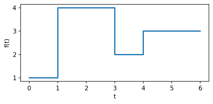
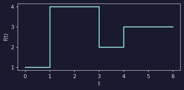
Show code
def plot_single_pcf():
    f = mpcf.Pcf(np.array([[0, 1], [1, 4], [3, 2], [4, 3]], dtype=np.float32))

    fig, ax = plt.subplots(figsize=(5, 2.5))
    plotpcf(f, ax=ax, max_time=6, linewidth=2)
    ax.set_xlabel("t")
    ax.set_ylabel("f(t)")
    fig.tight_layout()
    return fig
Overlaying many PCFs#
Pass a 1-D tensor to plot all elements at once. Use alpha to see overlapping
regions:
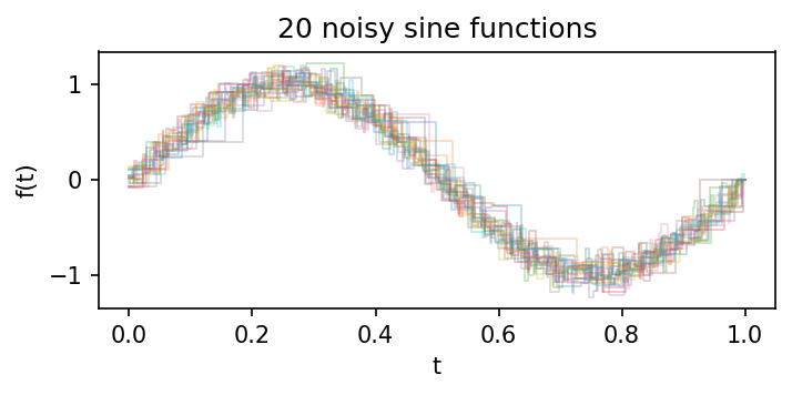
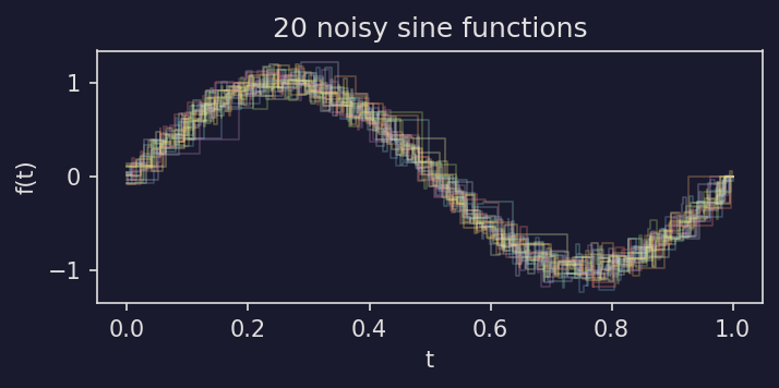
Show code
def plot_overlaid():
    X = noisy_sin((20,), n_points=80)

    fig, ax = plt.subplots(figsize=(5, 2.5))
    plotpcf(X, ax=ax, alpha=0.3, linewidth=0.8)
    ax.set_xlabel("t")
    ax.set_ylabel("f(t)")
    ax.set_title("20 noisy sine functions")
    fig.tight_layout()
    return fig
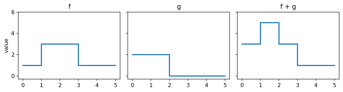
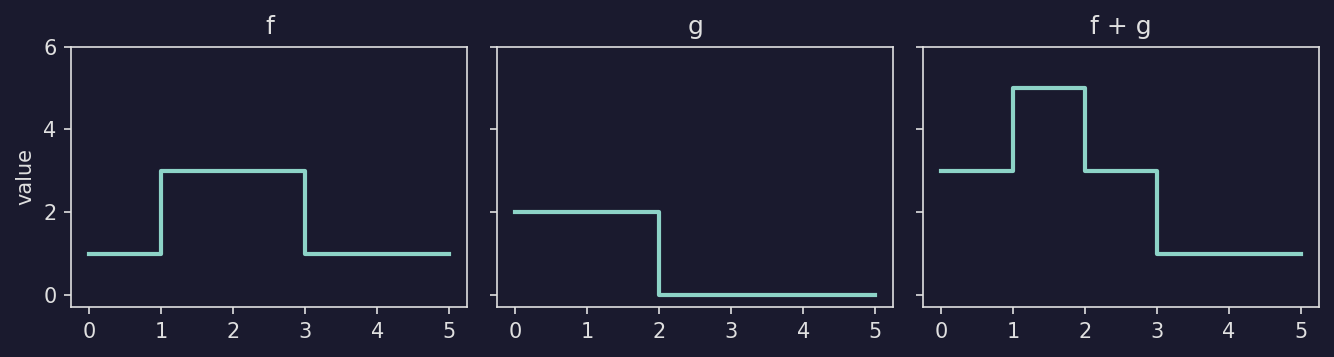
PCF arithmetic#
Since PCFs support pointwise arithmetic, you can visualize the result of operations like addition:
Show code
def plot_arithmetic():
    f = mpcf.Pcf(np.array([[0, 1], [1, 3], [3, 1]], dtype=np.float32))
    g = mpcf.Pcf(np.array([[0, 2], [2, 0]], dtype=np.float32))

    fig, axes = plt.subplots(1, 3, figsize=(9, 2.5), sharex=True, sharey=True)
    for ax, pcf, title in [
        (axes[0], f, "f"),
        (axes[1], g, "g"),
        (axes[2], f + g, "f + g"),
    ]:
        plotpcf(pcf, ax=ax, max_time=5, linewidth=2)
        ax.set_title(title)
        ax.set_ylim(-0.3, 6)
    axes[0].set_ylabel("value")
    fig.tight_layout()
    return fig
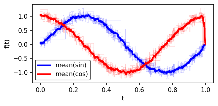
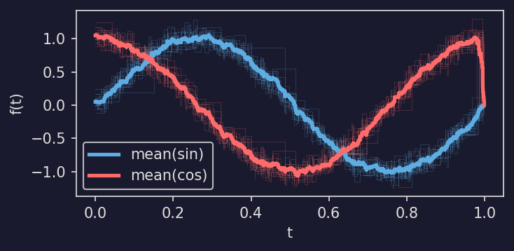
Highlighting the mean#
A common pattern is to plot individual noisy functions in the background with their mean highlighted in the foreground:
Show code
def plot_mean_highlight(sin_color="b", cos_color="r"):
    sines = noisy_sin((15,), n_points=100)
    cosines = noisy_cos((15,), n_points=100)

    fig, ax = plt.subplots(figsize=(5, 2.5))
    plotpcf(sines, ax=ax, color=sin_color, linewidth=0.5, alpha=0.2)
    plotpcf(cosines, ax=ax, color=cos_color, linewidth=0.5, alpha=0.2)

    plotpcf(mpcf.mean(sines), ax=ax, color=sin_color, linewidth=2.5, label="mean(sin)")
    plotpcf(mpcf.mean(cosines), ax=ax, color=cos_color, linewidth=2.5, label="mean(cos)")

    ax.set_xlabel("t")
    ax.set_ylabel("f(t)")
    ax.legend()
    fig.tight_layout()
    return fig
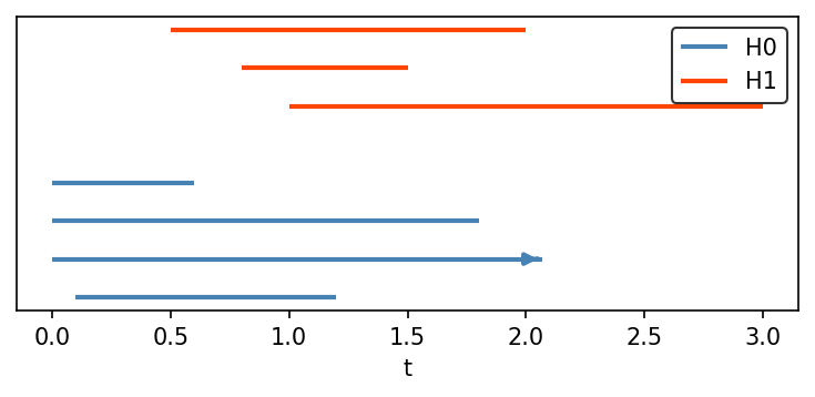
Persistence barcodes#
Use plot_barcode() to visualize persistence barcodes
as horizontal line segments. Each bar runs from its birth to its death value.
Bars with infinite death are drawn as arrows extending to the right edge of the
plot.
Stack multiple homology dimensions by passing y_offset:
Show code
def plot_barcode_example(h0_color="steelblue", h1_color="orangered"):
    from masspcf.persistence import Barcode
    from masspcf.plotting import plot_barcode

    bc_h0 = Barcode(np.array([
        [0.0, np.inf], [0.0, 1.8], [0.0, 0.6], [0.1, 1.2],
    ], dtype=np.float64))

    bc_h1 = Barcode(np.array([
        [0.5, 2.0], [0.8, 1.5], [1.0, 3.0],
    ], dtype=np.float64))

    fig, ax = plt.subplots(figsize=(5, 2.5))
    y = plot_barcode(bc_h0, ax=ax, color=h0_color, linewidth=2, label="H0")
    plot_barcode(bc_h1, ax=ax, y_offset=y + 1, color=h1_color, linewidth=2, label="H1")
    ax.set_xlabel("t")
    ax.set_yticks([])
    ax.legend()
    fig.tight_layout()
    return fig
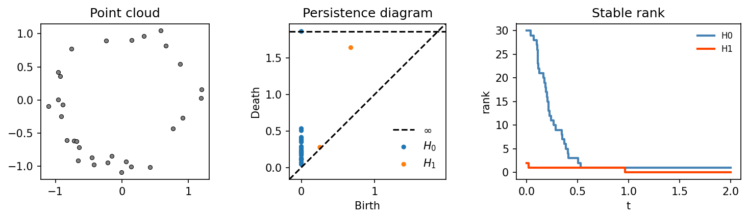
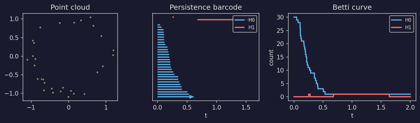
TDA pipeline#
A complete example: generate a random point cloud, compute its persistent homology, and plot the persistence diagram (via persim) alongside the stable rank:
Show code
def plot_tda_pipeline(h0_color="steelblue", h1_color="orangered"):
    from masspcf import persistence as mpers
    from masspcf.plotting import plot_barcode

    # 1. Noisy circle (clear H1 topology)
    rng = np.random.RandomState(10)
    theta = rng.uniform(0, 2 * np.pi, 30)
    r = 1.0 + rng.normal(0, 0.15, 30)
    points = np.column_stack([r * np.cos(theta), r * np.sin(theta)]).astype(np.float64)

    # 2. Compute persistent homology
    bcs = mpers.compute_persistent_homology(points, max_dim=1, verbose=False)
    bc_h0, bc_h1 = bcs[0], bcs[1]

    # 3. Convert to stable rank
    sranks = mpers.barcode_to_stable_rank(bcs)

    fig, (ax1, ax2, ax3) = plt.subplots(1, 3, figsize=(10, 3),
                                         gridspec_kw={"width_ratios": [1, 1, 1.2]})

    # Left: point cloud
    ax1.scatter(points[:, 0], points[:, 1], s=15, color="grey", edgecolors="black",
                linewidths=0.5)
    ax1.set_aspect("equal")
    ax1.set_title("Point cloud")

    # Middle: persistence diagram (via persim)
    import persim
    persim.plot_diagrams(
        [np.asarray(bc_h0), np.asarray(bc_h1)],
        ax=ax2, legend=True, show=False,
    )
    legend = ax2.get_legend()
    legend.get_frame().set_alpha(0)
    fg = ax2.xaxis.label.get_color()
    for text in legend.get_texts():
        text.set_color(fg)
    for line in ax2.get_lines():
        line.set_color(fg)
    ax2.set_title("Persistence diagram")

    # Right: stable rank
    plotpcf(sranks[0], ax=ax3, max_time=2, color=h0_color, linewidth=2,
            label="H0")
    plotpcf(sranks[1], ax=ax3, max_time=2, color=h1_color, linewidth=2,
            label="H1")
    ax3.set_xlabel("t")
    ax3.set_ylabel("rank")
    ax3.set_title("Stable rank")
    leg3 = ax3.legend(fontsize=8)
    leg3.get_frame().set_alpha(0)
    for text in leg3.get_texts():
        text.set_color(fg)

    fig.tight_layout(w_pad=1.5)
    return fig
Betti curve pipeline#
The same pipeline using a barcode plot and Betti curves:
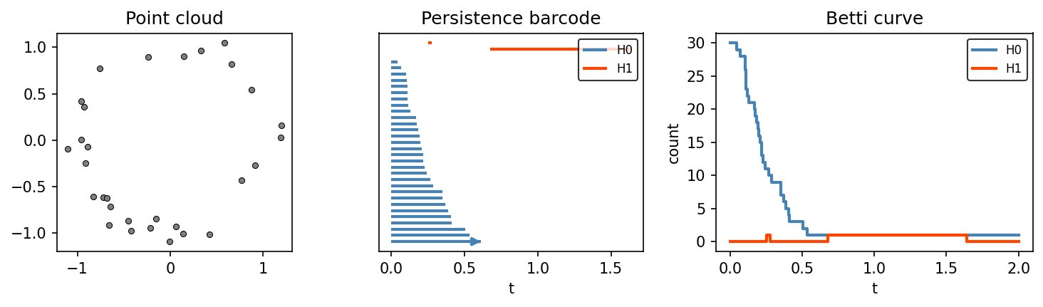
Show code
def plot_betti_pipeline(h0_color="steelblue", h1_color="orangered"):
    from masspcf import persistence as mpers
    from masspcf.plotting import plot_barcode

    # 1. Noisy circle
    rng = np.random.RandomState(10)
    theta = rng.uniform(0, 2 * np.pi, 30)
    r = 1.0 + rng.normal(0, 0.15, 30)
    points = np.column_stack([r * np.cos(theta), r * np.sin(theta)]).astype(np.float64)

    # 2. Compute persistent homology
    bcs = mpers.compute_persistent_homology(points, max_dim=1, verbose=False)
    bc_h0, bc_h1 = bcs[0], bcs[1]

    # 3. Convert to Betti curves
    bettis = mpers.barcode_to_betti_curve(bcs, verbose=False)

    fig, (ax1, ax2, ax3) = plt.subplots(1, 3, figsize=(10, 3),
                                         gridspec_kw={"width_ratios": [1, 1, 1.2]})

    # Left: point cloud
    ax1.scatter(points[:, 0], points[:, 1], s=15, color="grey",
                edgecolors="black", linewidths=0.5)
    ax1.set_aspect("equal")
    ax1.set_title("Point cloud")

    # Middle: persistence barcode
    y = plot_barcode(bc_h0, ax=ax2, color=h0_color, linewidth=2, label="H0")
    plot_barcode(bc_h1, ax=ax2, y_offset=y + 1, color=h1_color, linewidth=2,
                 label="H1")
    ax2.set_yticks([])
    ax2.set_xlabel("t")
    ax2.set_title("Persistence barcode")
    ax2.legend(fontsize=8)

    # Right: Betti curves
    plotpcf(bettis[0], ax=ax3, max_time=2, color=h0_color, linewidth=2,
            label="H0")
    plotpcf(bettis[1], ax=ax3, max_time=2, color=h1_color, linewidth=2,
            label="H1")
    ax3.set_xlabel("t")
    ax3.set_ylabel("count")
    ax3.set_title("Betti curve")
    ax3.legend(fontsize=8)

    fig.tight_layout(w_pad=1.5)
    return fig
max_time#
By default, a single PCF is plotted only up to its last breakpoint. Pass max_time to extend the final constant segment:
f = mpcf.Pcf([[0, 1], [2, 3]])
plotpcf(f, ax=ax, max_time=5)  # extends the plot to t=5
When plotting a 1-D tensor, all elements are automatically extended to the latest breakpoint across the tensor. Passing max_time overrides this with a custom value.
Styling#
The plot function accepts any keyword arguments that matplotlib’s step function does (color, linewidth, alpha, label, etc.). When plotting a 1-D tensor with auto_label=True, each PCF is automatically labeled as f0, f1, etc.